Published Sep 19, 2006
Well, ok, it’s not the same, but, well, it sounded like a catchy headline. Anyway, welcome to my new look. It’s big, and it’s dark grey, and it’s got my moblog right at the top, and I love it.
So, what’s new here? Well, like I said, there’s the moblog right at the top. The photos are now big, rather than postage stamp-sized, which will hopefully force me to work harder on my composition. Plus on making little vignettes from big-sized photos.
The blog content on the side is now large enough to read, which, hopefully, will incline people to actually read it. Also blog entries now have comments turned on, which I know will please at least one, or 25%, of my readers.
And, yes, I know that in general the text on everything is big. I’m into big these days. Maybe it’s because I like leaning back on my couch, putting my laptop on my legs (it’s too hot to sit over the ‘ol package) and read, and that’s much easier with big text. But, in general, big type is a trend and that’s one trend I like. After all, this here blog is all about content, and so the content should be big and readable. And if you don’t like the big text then get Firefox and resize it, because I like the big text. Can you tell that this has been the most unpopular feature with beta testers? Yeah I’m maybe a little defensive.
I also get rid of the poorly-conceived unified archives, not like anyone browses the archives anyway. But now the moblog, blog, and diary are all broken out and easily browseable. With everything broken out, there’s now a seperate blog and diary RSS feed, so make sure to update your subscriptions appropriately.
Speaking of feeds, there’s a feed of new WadeArmstrong.com and Cleverbird.com entries now on the front page, so if you’re interested in those sites you can keep up and, if you’re not, you can feel free to ignore.
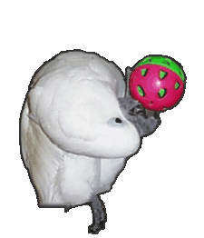
And there’s a new color, blue, which is the color of the skin around Junior’s eyes. The yellow is now closer to the yellow on Junior’s feathers, and the text is now white, like his feathers. It’s nice to have a palette that walks and talks.
Anyway, sorry this redesign took so long; I lost days trying to figure out a mostly undocumented change in the way Movable Type handles comments, but at least I actually like the change; it makes my life easier. I’m also too lazy to switch to Wordpress.
My badass gangsta neighbor is listening to “Holiday” by Madonna. I think that’s my cue to wrap this entry. Thanks for sticking around, readers.

Yay for big, readable text!
Well I’m glad there’s one person on my side on this! Because everyone else has been solidly contra.
As an addendum, I’ve quashed a number of annoying commenting-related bugs, especially several having to do with the blog comment pop-ups. Sorry to everyone who tried to comment and was excessively annoyed by the process! And especially thanks to Auros for writing a comment that I needed to reply to and thus forcing me to experience my own bugs first-hand; I swear I did at least a little QA before I launched this redesign. Hopefully no other similarly-large bugs will appear anytime soon.
Plus, if you bookmarked entries, yes, that should be fixed now. Rewriting changed URLs doesn’t work very well if you haven’t uploaded the latest .htaccess file with all the rules in it.
wow, that’s some mighty BIG text.
;-P
I’m seriously not making it smaller. Dammit, is it really that bad?
I hope that was rhetorical. :)
No, I really care about your opinions. Share!